如何在 pandas 中创建图表?#
In [1]: import pandas as pd

In [2]: import matplotlib.pyplot as plt
- 空气质量数据
In [3]: air_quality = pd.read_csv("data/air_quality_no2.csv", index_col=0, parse_dates=True)

In [4]: air_quality.head()
Out[4]:
                     station_antwerp  station_paris  station_london
datetime
2019-05-07 02:00:00              NaN            NaN            23.0
2019-05-07 03:00:00             50.5           25.0            19.0
2019-05-07 04:00:00             45.0           27.7            19.0
2019-05-07 05:00:00              NaN           50.4            16.0
2019-05-07 06:00:00              NaN           61.9             NaN
注意
使用
read_csv函数的index_col和parse_dates参数,分别将结果DataFrame的第一(0)列定义为索引,并将列中的日期转换为Timestamp对象。
我想快速目视检查数据。
In [5]: air_quality.plot()
Out[5]: <Axes: xlabel='datetime'>

In [6]: plt.show()

对于
DataFrame,pandas 默认会为每个包含数值数据的列创建一个线图。
我只想绘制数据表中包含巴黎数据的列。
In [7]: air_quality["station_paris"].plot()
Out[7]: <Axes: xlabel='datetime'>

In [8]: plt.show()

要绘制特定列,请结合使用 数据子集教程 的选取方法和
plot()方法。因此,plot()方法适用于Series和DataFrame。
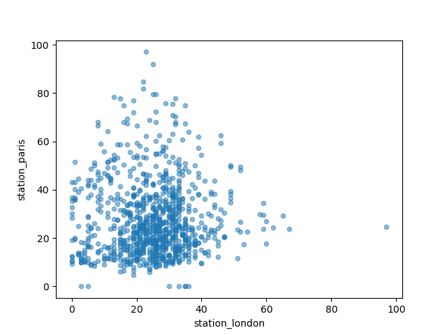
我想直观地比较伦敦和巴黎测量的 \(NO_2\) 值。
In [9]: air_quality.plot.scatter(x="station_london", y="station_paris", alpha=0.5)
Out[9]: <Axes: xlabel='station_london', ylabel='station_paris'>

In [10]: plt.show()
除了使用 plot 函数时的默认 line 图之外,还有许多其他绘图方法可用。让我们使用一些标准 Python 来概览可用的绘图方法
In [11]: [
   ....:     method_name
   ....:     for method_name in dir(air_quality.plot)
   ....:     if not method_name.startswith("_")
   ....: ]
   ....:
Out[11]:
['area',
 'bar',
 'barh',
 'box',
 'density',
 'hexbin',
 'hist',
 'kde',
 'line',
 'pie',
 'scatter']
注意
在许多开发环境以及 IPython 和 Jupyter Notebook 中,使用 TAB 键可以概览可用的方法,例如 air_quality.plot. + TAB。
其中一个选项是 DataFrame.plot.box(),它指的是箱线图。box 方法适用于空气质量示例数据
In [12]: air_quality.plot.box()
Out[12]: <Axes: >

In [13]: plt.show()

有关除默认线图之外的其他图表介绍,请参阅用户指南中关于支持的绘图样式的部分。
我希望每列数据都在单独的子图中显示。
In [14]: axs = air_quality.plot.area(figsize=(12, 4), subplots=True)

In [15]: plt.show()

每个数据列的单独子图都受
plot函数的subplots参数支持。pandas 各个绘图函数中可用的内置选项值得查看。
更多格式化选项在用户指南的绘图格式设置部分进行了说明。
我想进一步自定义、扩展或保存生成的图表。
In [16]: fig, axs = plt.subplots(figsize=(12, 4))

In [17]: air_quality.plot.area(ax=axs)
Out[17]: <Axes: xlabel='datetime'>

In [18]: axs.set_ylabel("NO$_2$ concentration")
Out[18]: Text(0, 0.5, 'NO$_2$ concentration')

In [19]: fig.savefig("no2_concentrations.png")

In [20]: plt.show()

pandas 创建的每个绘图对象都是一个 Matplotlib 对象。由于 Matplotlib 提供了大量自定义绘图的选项,明确 pandas 和 Matplotlib 之间的联系可以将 Matplotlib 的所有功能应用于绘图。此策略已应用于前面的示例中
fig, axs = plt.subplots(figsize=(12, 4))        # Create an empty Matplotlib Figure and Axes
air_quality.plot.area(ax=axs)                   # Use pandas to put the area plot on the prepared Figure/Axes
axs.set_ylabel("NO$_2$ concentration")          # Do any Matplotlib customization you like
fig.savefig("no2_concentrations.png")           # Save the Figure/Axes using the existing Matplotlib method.
plt.show()                                      # Display the plot
记住
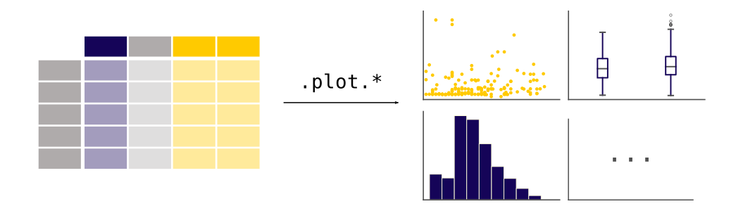
.plot.*方法适用于Series和DataFrames。默认情况下,每个列都作为不同的元素(线图、箱线图等)绘制。
pandas 创建的任何图表都是一个 Matplotlib 对象。
pandas 绘图的完整概览可在可视化页面中找到。